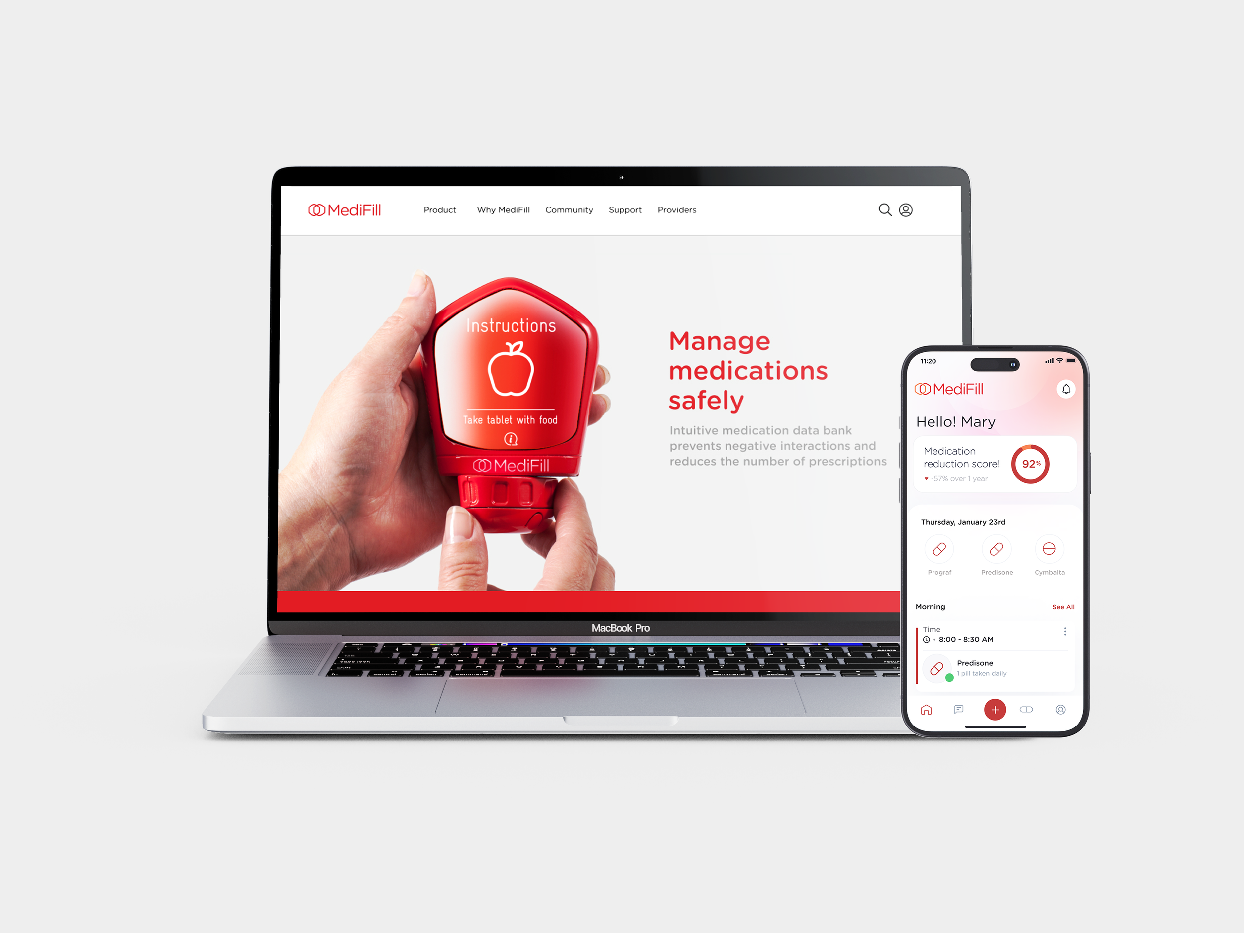
MediFill
Exploring the Future of Medication and Treatment Management
Client
MediFill Healthtech
scope
2021–2023
Role
Multidisciplinary Designer
My contributions
Video demo reel, wireframing, prototypes, and interaction designs.
OVERVIEW
Background
In the U.S., over 32 million adults take three or more medications daily, yet 75% do not take their prescriptions as directed. This leads to an estimated $300 billion in avoidable healthcare costs annually. Despite widespread use, most medication management tools fail to support users effectively—especially when it comes to sustaining adherence over time.
Design Problem
How might we reimagine the pill bottle experience and introduce smarter, more human-centered ways for people to manage their treatment regimens?
For many, medications are an integral part of everyday wellness. Yet traditional pillboxes and digital reminders often fall short—failing to account for the habits, anxieties, and cognitive load medication users face. Our research pointed to an opportunity: create an intelligent system that supports, adapts to, and empowers individuals to stay on track.
Solution
A medication management product that helps people comply to their medication regimens and never miss a refill.
Project Goals
To design an improved medication adherence system, we focused on five core research objectives:
Identify key user demographics interacting with dosage identification tools
Understand expectations and challenges around managing multiple medications
Analyze current competitors and market trends
Uncover latent user needs, fears, and behavioral assumptions
Evaluate the limitations of current pillbox and adherence tracking experiences
Research Approach
Our team conducted user interviews, competitive audits, and behavioral mapping exercises to understand how people currently navigate their medication routines. We specifically engaged with individuals who use or are familiar with pillboxes and digital tracking solutions.
Key Research Questions
Capabilities of Existing Tools
What features do current medication tracking tools offer, and how do they meaningfully support users in managing adherence?User Awareness of Adherence Patterns
How do users perceive their own medication habits? What is their level of awareness and confidence in managing their regimen?Barriers and Mental Models
What strategies do users currently employ to overcome challenges throughout their adherence journey? How might we reshape mental models around treatment responsibility?
APPROACH
How I Work

DISCOVER
Primary Research
We conducted market research and competitive analysis to uncover industry trends and evaluate the strengths and weaknesses of current competitors.


• Market Positioning • Market Trends & Analysis. • STEEP Analysis • Stakeholder Mapping • Medication Adherence Drivers
Secondary Research
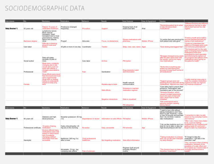
To answer our research questions, we administered a targeted survey to users familiar with pillboxes—specifically those with a strong understanding of dosage identification tools. This helped us uncover key insights into user motivations and behaviors.
We surveyed five participants, all aged 45–54, with complex medication routines. The sample included 75% Baby Boomers and 25% Gen X, all of whom were experienced app users with intermediate proficiency in managing manual pillboxes.


• Observation Studies • User Interviews • Coding
Key Insights
The insights we gathered informed the development of our core design principles.

DEFINE
Proposed Solution

Design Principles
Key insights revealed the core value of medication tracking and highlighted opportunities for enhancement across three main areas:

Medication Adherence Journey Map
Capturing the current medication adherence journey was the first important mapping of the existing situation. In addition, it was important to identify patient related non-adherence behaviors and plotting them on the user journey map.

Key Solution Elements
Collective Medication Bank – A shared database for managing and verifying prescribed medications.
AI-Powered Regimen Assistant – Conversational AI to guide users through their personalized medication routines.
Actionable Tasks – Clear, timely prompts to support daily adherence and accountability.
Adherence Score – A dynamic metric to help users track progress and identify areas for improvement.
POV Statement & HMW Questions
A problem statement, or Point of View, was crafted to clarify the target users, their core needs, and the key insights that shaped the design direction.
“MediFill users need a way to improve the adherence process because the existing tracking tools still present certain limitations.”
By articulating and expanding the Point of View (POV), we generated How Might We (HMW) questions to reflect user needs and spark solution-focused thinking. These questions encouraged a range of ideas and opened the door to multiple design possibilities:
How might we improve the medication adherence process?
How might we explore better options for treatment management?
How might we eliminate unnecessary features?
How might we make the tracking process more efficient?
User Persona
After synthesizing interview data, we developed key user personas to clearly define the target audience and demonstrate how the new features would add value for regular users of medication tracking tools.


IDEATE
Concept Storyboards What-If-Scenarios
After (1) gaining a deep understanding of the current (As-Is) experience, (2) identifying opportunities for user-centered improvements, and (3) aligning with broader strategic priorities, we began envisioning a future (To-Be) experience.
Our goal was to apply the three emerging design principles to visualize solutions that enhance the efficacy of medication tracking tools. I contributed by developing a range of digital health concepts focused on self-service medication adherence features. From generating seven distinct concepts to creating storyboards and mapping task flows, these artifacts became essential in communicating the design team’s vision for a transformed, user-centered experience.


Synthesis of Findings
I applied the Rose-Bud-Thorn method to systematically assess each concept’s strengths, weaknesses, and opportunities. This evaluation offered a holistic view of the factors driving their success or failure, highlighting the Collective Medication Data Bank as the most promising concept.


DESIGN
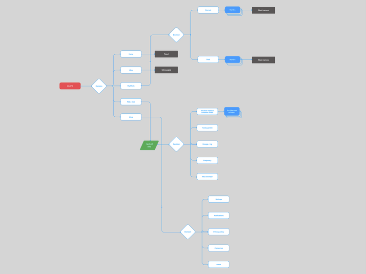
Information Architecture
At this stage, we developed a logical and intuitive structure to ensure seamless access to relevant content. Through my contribution, I gained insights into users’ mental models and expectations when managing medications within a digital health app. I focused on content strategy, data organization, and designing a clear navigation system—ultimately creating a more efficient and user-friendly experience that makes finding information effortless.

User Flow
When preparing the user flow, we focused on mapping the sequence of steps users take to complete tasks within the application. This required a deep understanding of user goals and needs to create intuitive pathways that enable efficient task completion. The resulting user flows incorporated features such as Personalized Reminders, Smart Filters, and the Collective Medication Data Bank. Through this process, I gained valuable insights into user interactions, which informed interface design, the creation of interactive elements, and usability testing with real users.
This approach enabled the team to visualize the entire user journey, identify potential pain points, and uncover opportunities to enhance user satisfaction and engagement.
Approaches


USABILITY TESTING
Affinity Diagram
Usability testing uncovered valuable insights for enhancing the product from the customer’s perspective. After testing, I organized the findings into an Affinity Diagram to identify pain points, frustrations, opportunities for improvement, and successes.


Solutions
Users like the idea of a Collective Medication Data Bank feature that allowed them to speed up the workflow of adding their medications and track them over time.
Users found the notification alert of their data and suggestions based on emerging patterns helpful when tracking adverse reactions.
Behaviors
Users wanted to know how to connect with other medication users if they shared a similar experience to improve connectivity with an exchange of stories and opinions.
Pain Points
Text inside the notification pop-ups were too small and difficult to read.
Successes
Enlarge notification text and pop-ups window size for better legibility.
ITERATION
Revisions
Necessary changes were made to the prototype so the user could better utilize and understand the medication tracking tool. Refinements included additions to tasks based on participants’ feedback. Allowing the user to add; customizable medication condition category with a log of their data and subsequent suggestions based on emerging patterns to improve the Collective Medication Data Bank.
Defining Features

Mid-Fidelity Wireframing
An emphasis on collaboration, iterative development, and user feedback led to unique screens and key user flows to be designed in mid-fidelity renders communicating the “look and feel” of the product.
Can help communicate how aesthetic features can support essential functionalities.
Created in a monochrome and grayscale to enable focus on layout, content, components, and user flow.


Prototype
I contributed to the development of the clickthrough prototype to capture the flow and overall organization of the design concept. Leading the team towards stages focusing on aligning and prioritizing decisions for our next move by focusing on the intersection of importance and feasibility. With preliminary sketches in hand, we collaborate with the development counterparts to understand how our To-be-experience aligns with the product roadmap. As a group, we use a prioritization grid to understand what parts of the proposed experience have both high user value and technical feasibility. This helped to clarify what we can commit to for a given release.
REFLECTION
• I learned that one can design health oriented devices to be user-friendly as ecommerce apps and visually appealing as top-tier consumer product apps.
• Medical devices can take years to develop, test, and go-to-market. I made it a habit to detail the rationale behind my designs and meticulously organize my design files. I leaned into diagrams to support onboarding collaborators to projects.