
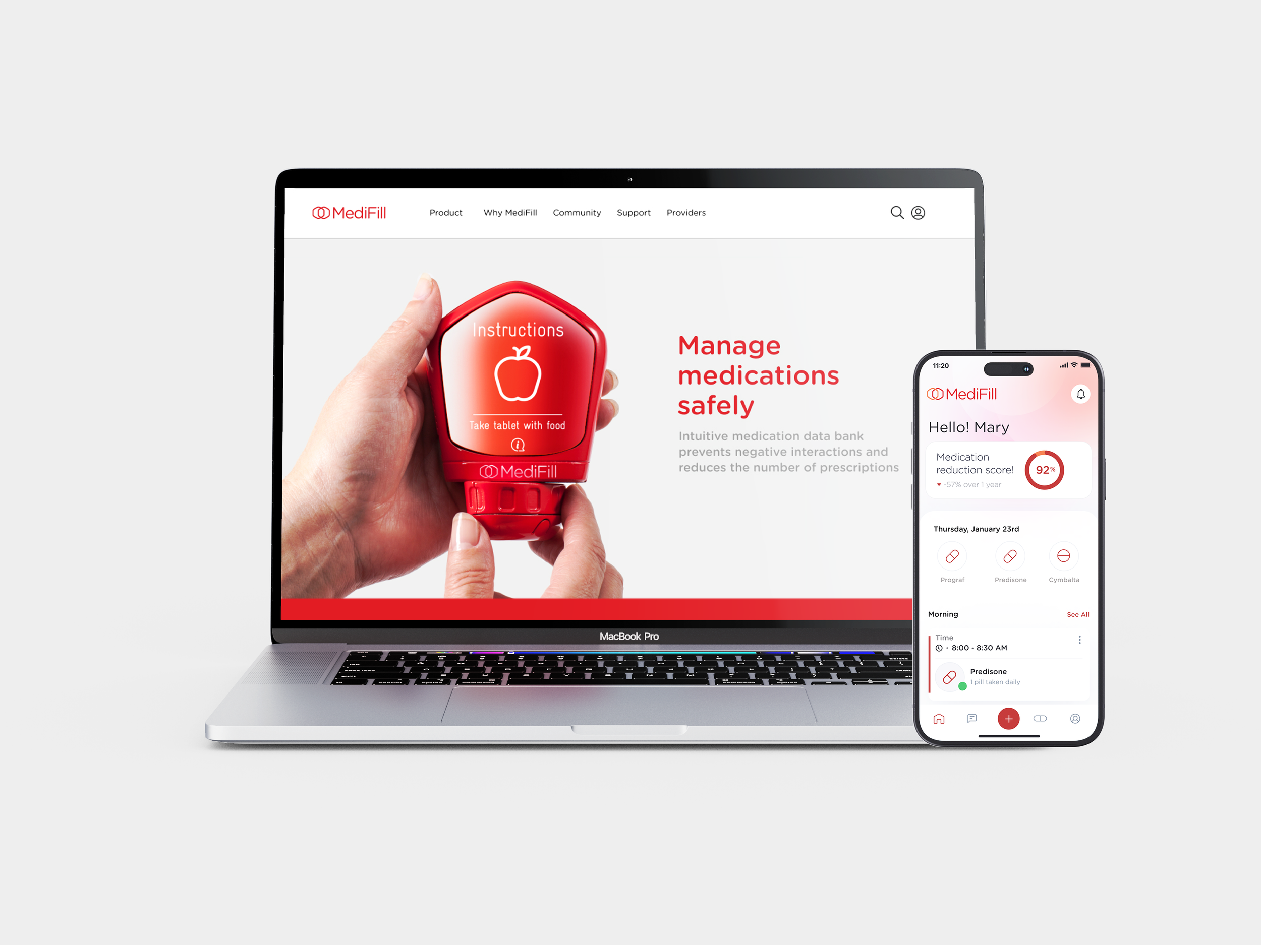
Designing medication tracking people trust, not fear | MediFill
How research turned a medication tracker from a report card into a source of encouragement for patients and their caregivers.
Scope
2021–2023
Role
Co-Founder · UX Designer + Service Design
What I did
Stakeholder mapping, 5 discovery interviews (ages 28–80), journey mapping, concept ranking of 6 concepts (Rose-Bud-Thorn), physical prototyping, user flows, paper prototyping, usability testing (4 participants), High-Fidelity UI
Team
Co-Founder · Brand Designer + Content Strategist
Tools
Figma, Miro
Overview
Patients on complex regimens, and the caregivers behind them, abandon trackers that feel like report cards. Research showed an adherence score could make people panic, and paper testing showed users got lost before they ever saw their medications. I rebuilt the flow so medications appear immediately, and rewrote the progress ring from a grade into encouragement.
01 - The problem: tracking that feels like judgment
People on several daily medications rely on a pill box, phone alarms and memory. A pill box holds pills, but it can't say which ones interact, keep a record, or show a caregiver what was missed. The tools that do track adherence often turn it into a score, and a low score feels like failing.
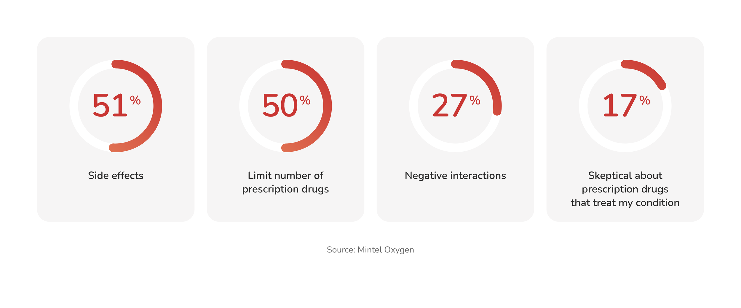
Medication users' top concerns: side effects, number of prescriptions, negative interactions. Source: Mintel Oxygen.
02 - Two people, one regimen
Complex regimens are rarely managed alone. Mapping the system showed a patient at the center, a caregiver doing much of the coordination, and pharmacies, doctors and apps around them, but every tool we found was built for one person.
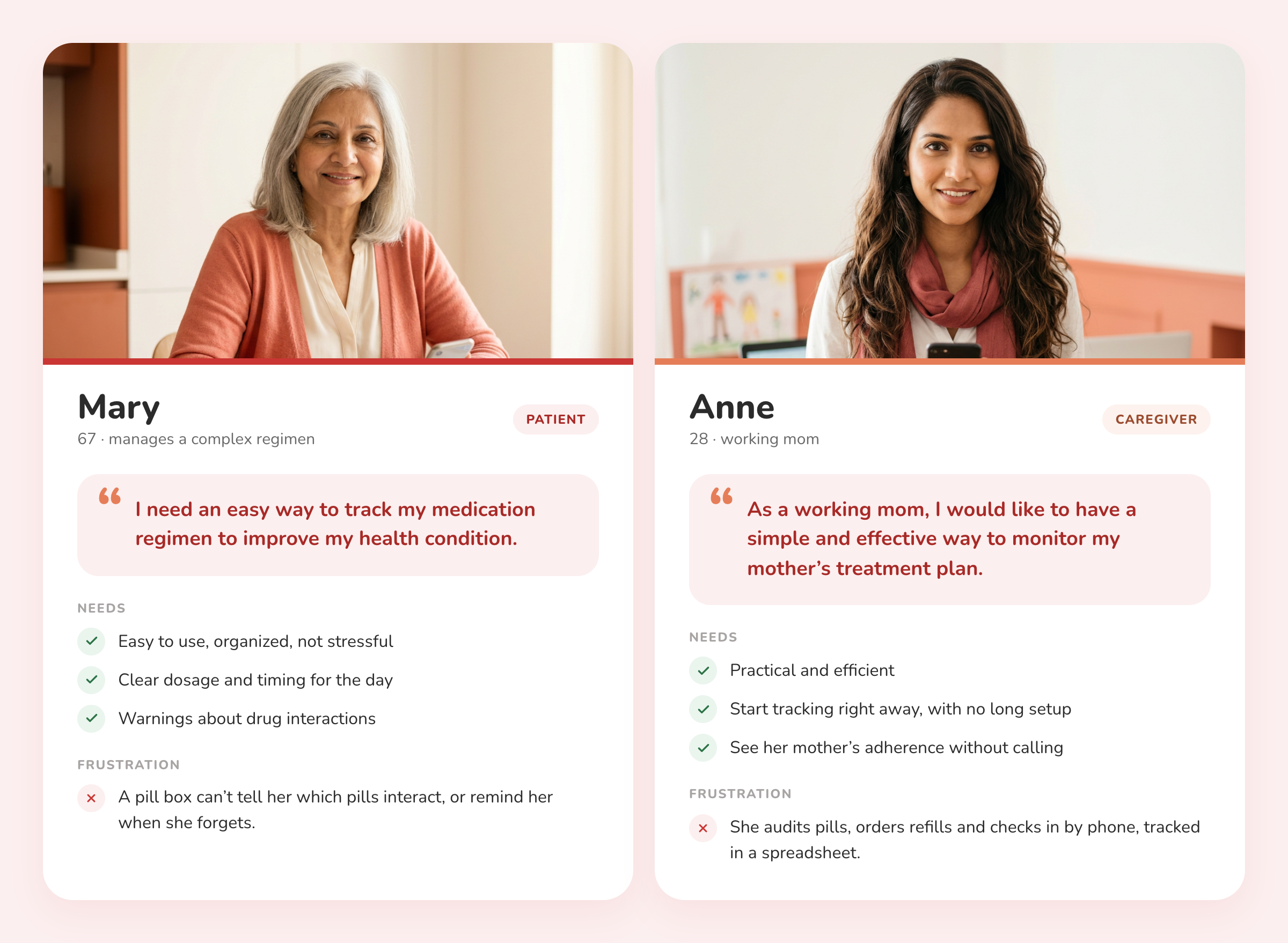
Mary, the patient, and Anne, her daughter and caregiver. Two people with different needs from the same tool.
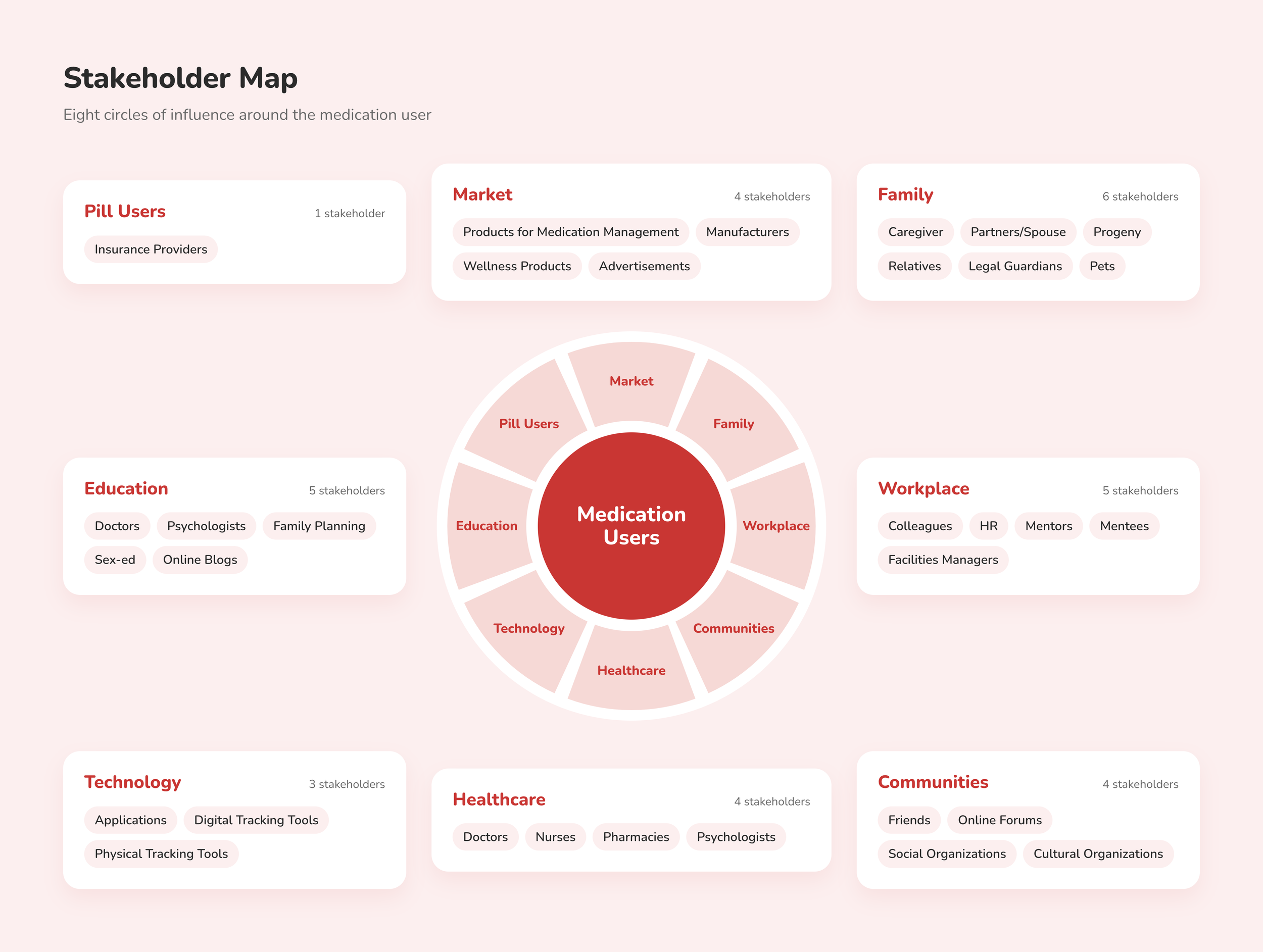
Stakeholder map. Medication users at the center; family, caregivers, pharmacies, doctors and tracking tools around them.
The journey map showed where the system leaks. At the Exit stage, when pills run low, the caregiver audits supply and orders refills, often tracked in Google Sheets, and reports feeling "time famine" and "exhausted." Every refill depended on one tired person remembering.

The Exit stage of the patient and caregiver journey. Refills ran on a spreadsheet and the caregiver's memory.
03 - What research told us
Five discovery interviews with people aged 28–80 on complex regimens pointed to three principles. Tracking only has value when people can make sense of their data, trust what the tool tells them, and stay motivated to keep going.
• Market Positioning • Market Trends & Analysis. • STEEP Analysis • Stakeholder Mapping • Medication Adherence Drivers
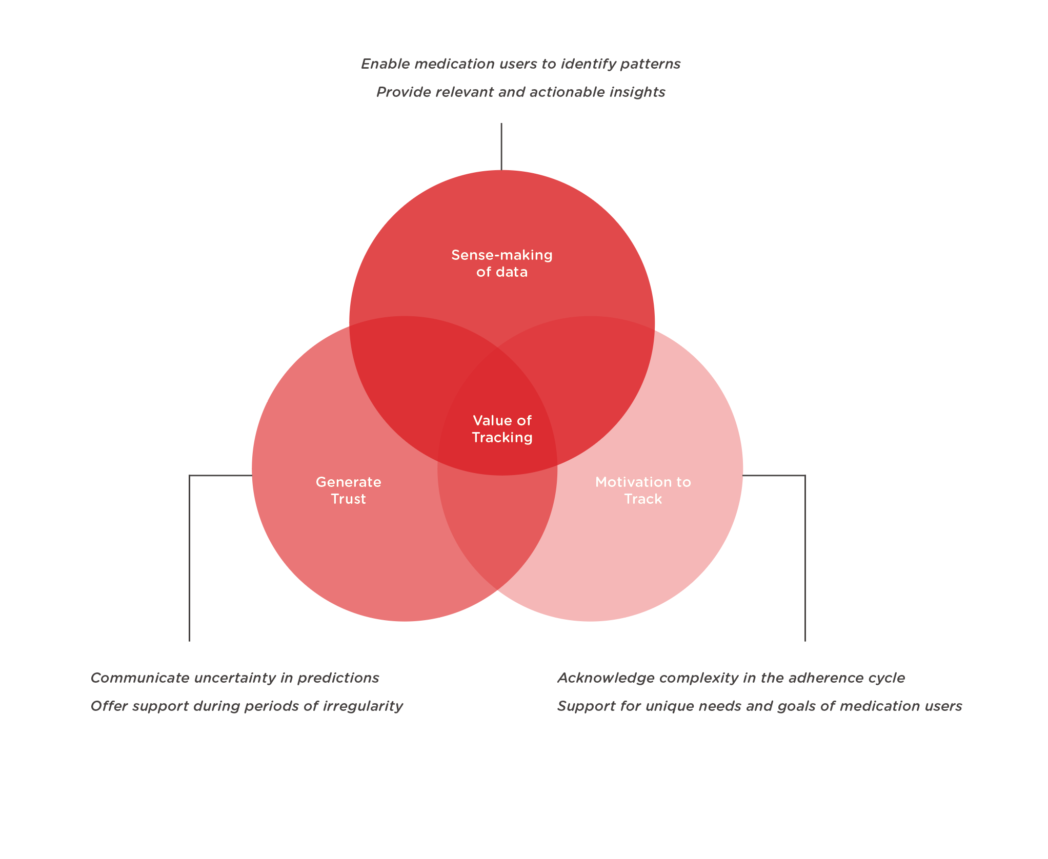
Three design principles: sense-making of data, generate trust, motivation to track
We then ranked six concepts with users. The adherence score, the feature most trackers lead with, came back with a warning: a score "can be judgmental" and "make people feel panic if score is low." The concept with no thorns was the Collective Medication Bank, which became the core of the product.
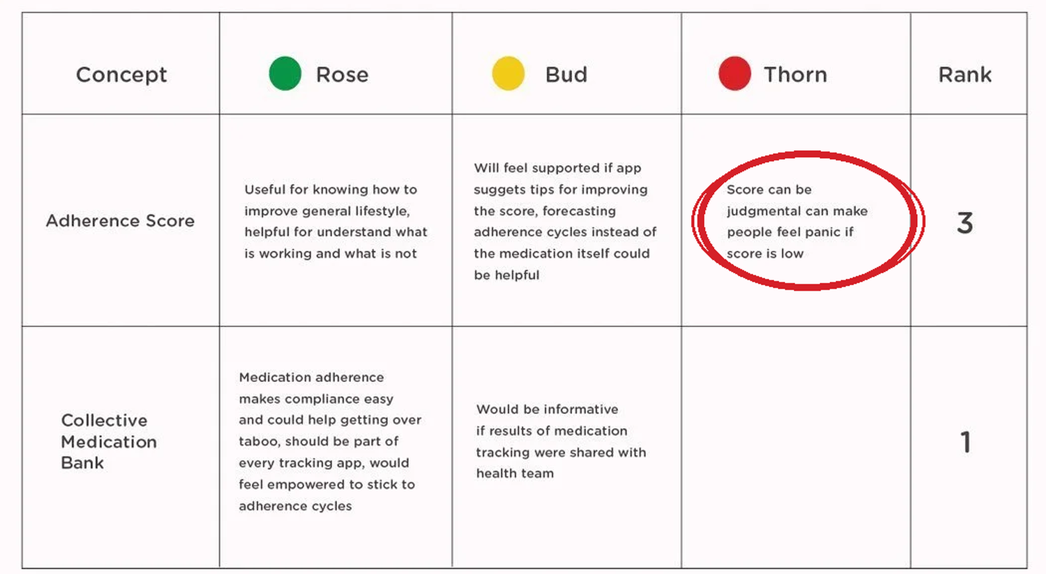
Concept ranking. The adherence score's thorn reframed the product; the Collective Medication Bank ranked first.
04 - Testing the flow
I sketched the MyMed flow as a paper prototype and tested it with 4 participants. Each completed four tasks: navigate to MyMed, find a specific medication (Prograf), review the MyMed Summary, and return to the dashboard. Tasks were given first as short prompts, then as realistic scenarios.
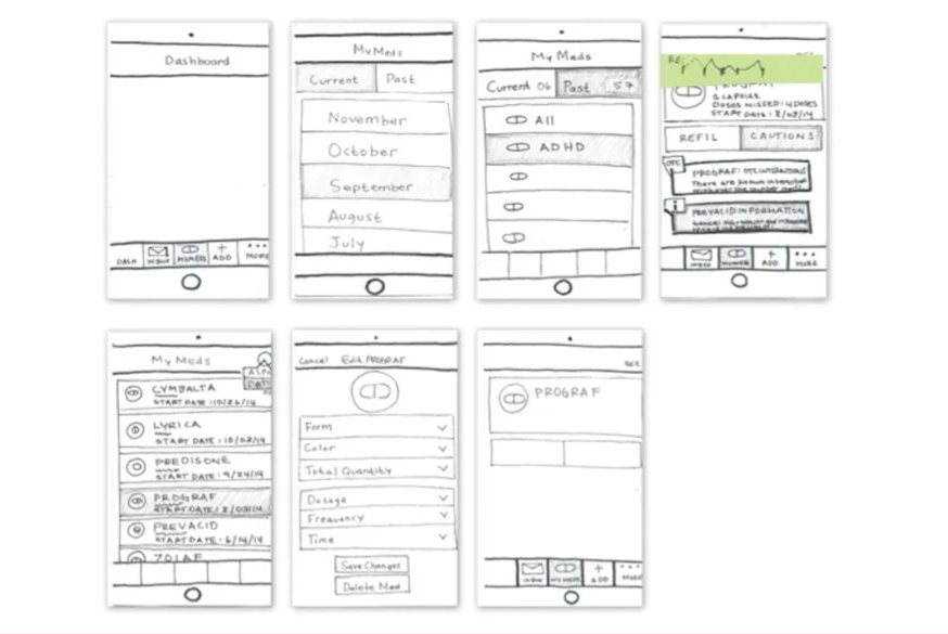
Paper prototype of the MyMed flow, from dashboard to medication details.
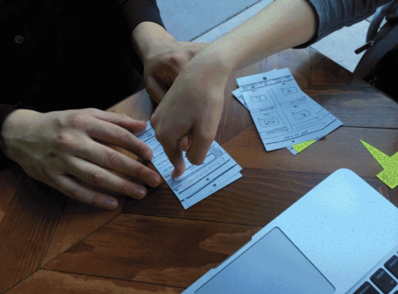
A testing session with the paper prototype.
Every finding led to a specific change.
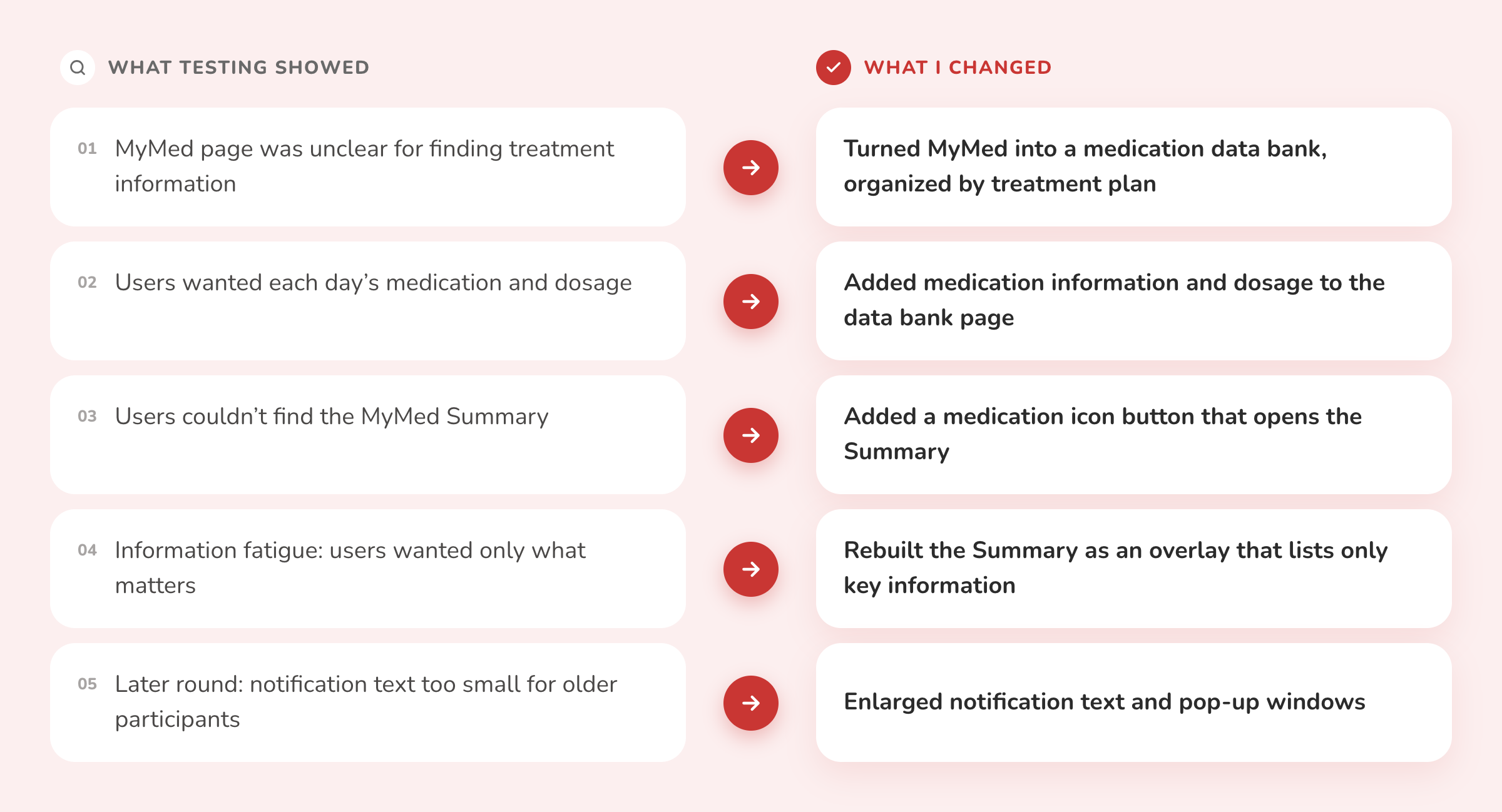
What testing showed, and what I changed.
"Could not understand the patterns of dosages and could not memorize prescriptions using a pill box."
— Test participant
05 - Rebuilding the flow
The original flow asked people to choose a month, then a medication, before they saw anything useful. That is two decisions before the answer, at the moment people are most motivated to start. I removed both: medications now appear as soon as MyMed opens, reminders sit inside the path, and both routes end at one summary. The number of taps to reach the summary stayed at three; what dropped was the thinking each tap required.
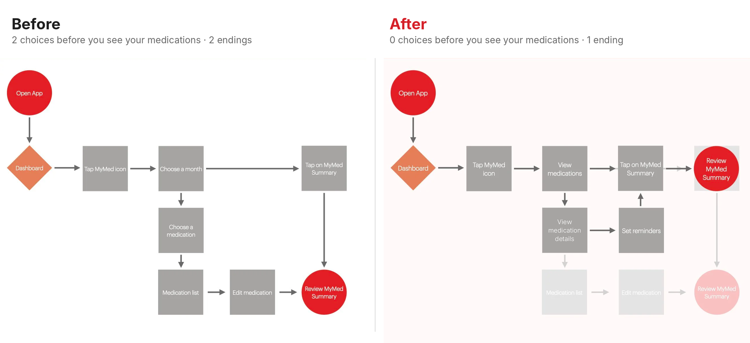
Before, 2 choices and 2 endings. After, 0 choices before you see your medications and 1 ending.
06 - Testing with caregivers
With the flow rebuilt, I wireframed the full app: home, pill history, conditions, my pills, and a seven-step flow for adding a new medication. Because caregivers do much of the setup, I tested the wireframes with 6 caregivers who used pill tracker apps to varying degrees. The goal was to learn the hierarchy of information, and which layouts let people understand each page fastest.
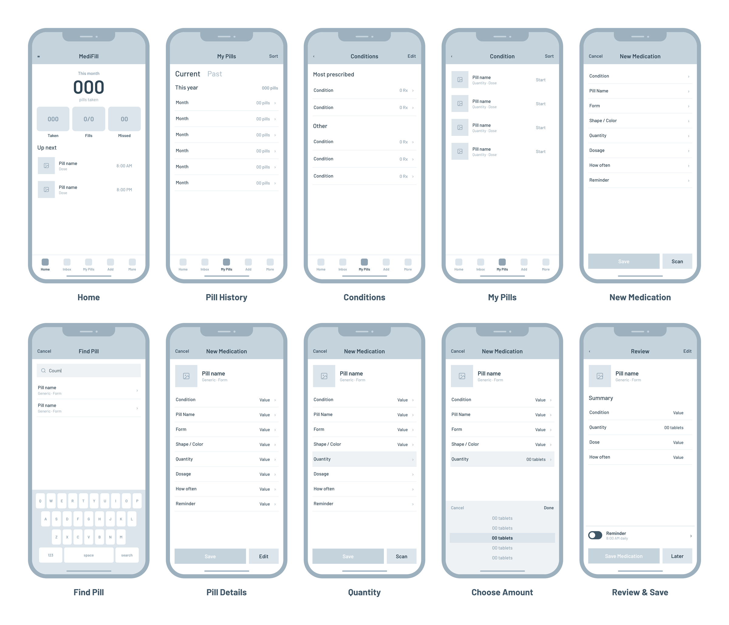
Lo-fi wireframes, from the home overview through finding, adding and saving a new medication.
Three changes came out of it:
One clear progress signal. Caregivers read three equal tiles (taken, fills, missed) as competing numbers. They wanted one progress percentage, with fills and missed doses as detail.
Separate current and past. Splitting current from past prescriptions let them find what needs attention today without scanning a year of history.
Group the form. One long form felt overwhelming. Grouping fields by what the pill is, how much there is, and when it is taken added confirmation for first-time users.
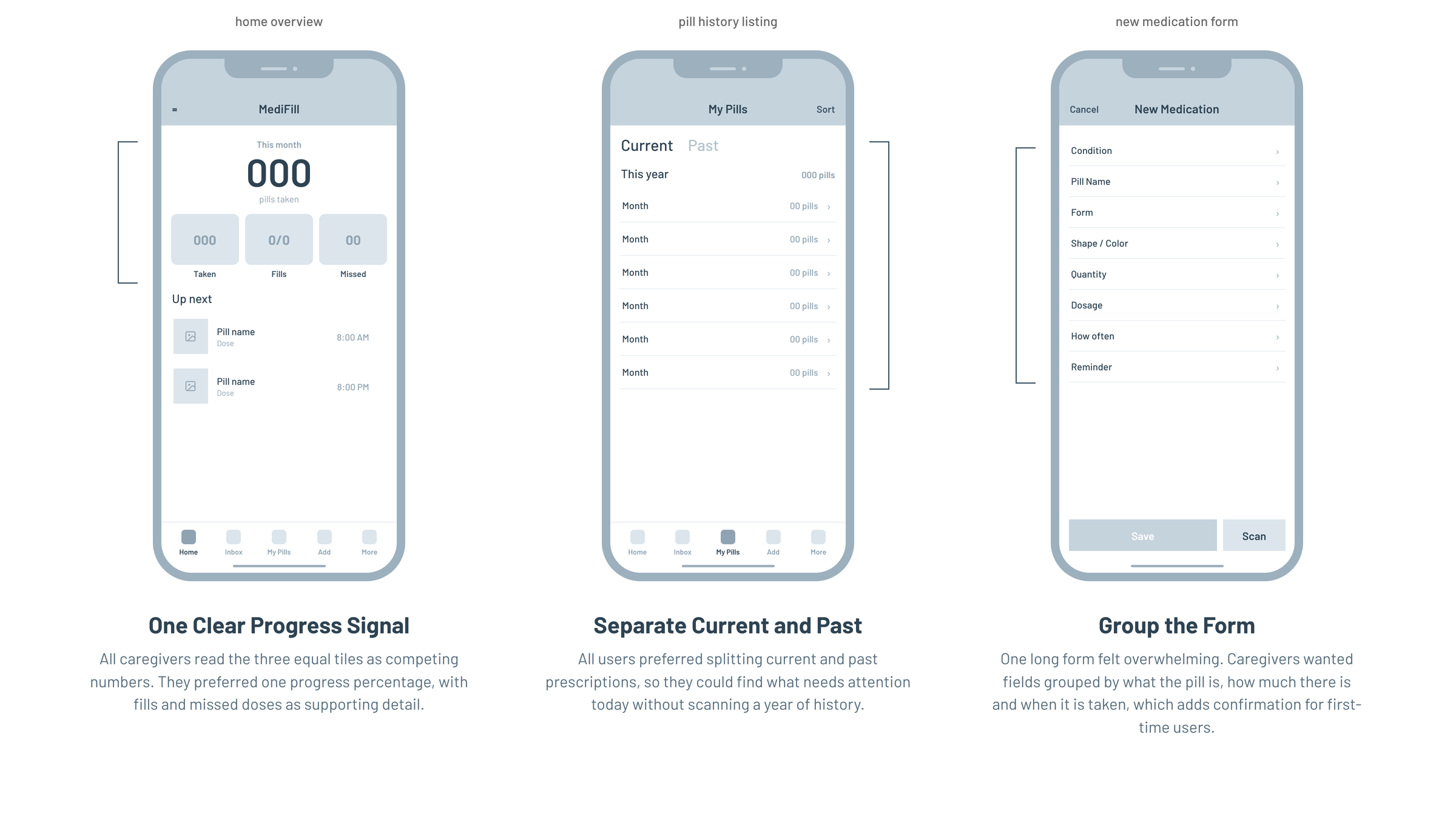
Key takeaways from wireframe testing with 6 caregivers.
07 - The moment that mattered: rewriting the ring
Two findings pulled in opposite directions. Caregivers wanted one clear progress number instead of three tiles. But concept research had warned that a score "can be judgmental" and make people panic when it is low. Dropping the progress ring would have taken away what caregivers asked for; keeping it as a grade would have kept what patients feared.
So I kept one ring and changed what it said. "Great overall progress for Meds" became "You're almost done!" The same number now reads as a finish line, not a mark on a report card. That voice carries into the final app: the ring says "Morning done!" after the morning doses and "Almost there" when the evening ones are snoozed.
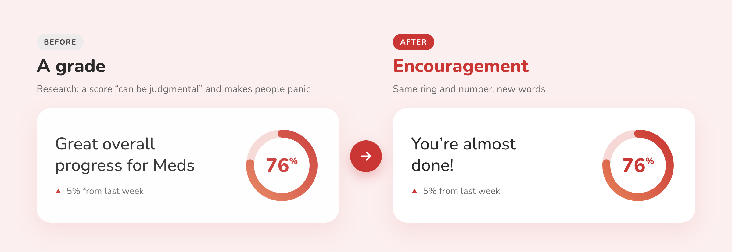
Same ring, same number, new words. Research changed the interface down to a single line of copy.
“A tracker that judges people is one they stop opening.”
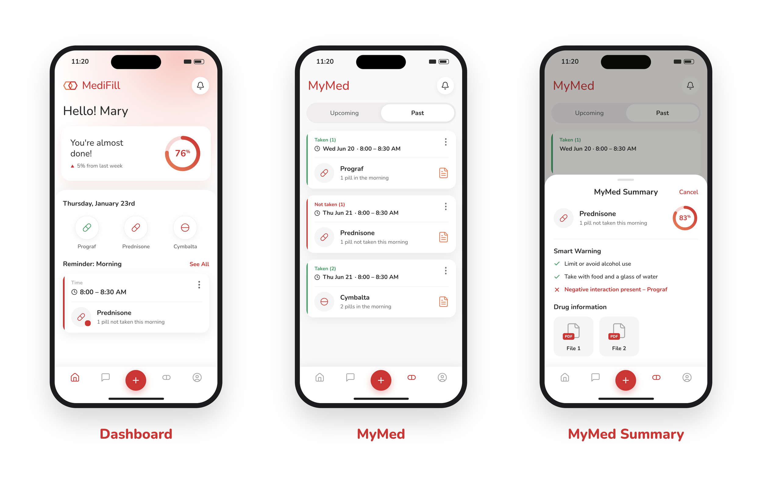
08 - Design exploration: three features, three alternatives each
For each core feature I designed a final candidate and three alternatives, then tested them. Showing the options I rejected is the point: each choice traded clarity, speed or disruption against the others.
Medication Reminder. The goal was the easiest, quickest reminder to read. Grouping doses by time of day meant the time is read once, not per pill, and one-tap Take keeps the action on the same row. Testing showed every participant wanted both an on-page reminder and a lock-screen notification, so the notification mirrors the page: take or snooze without opening the app.
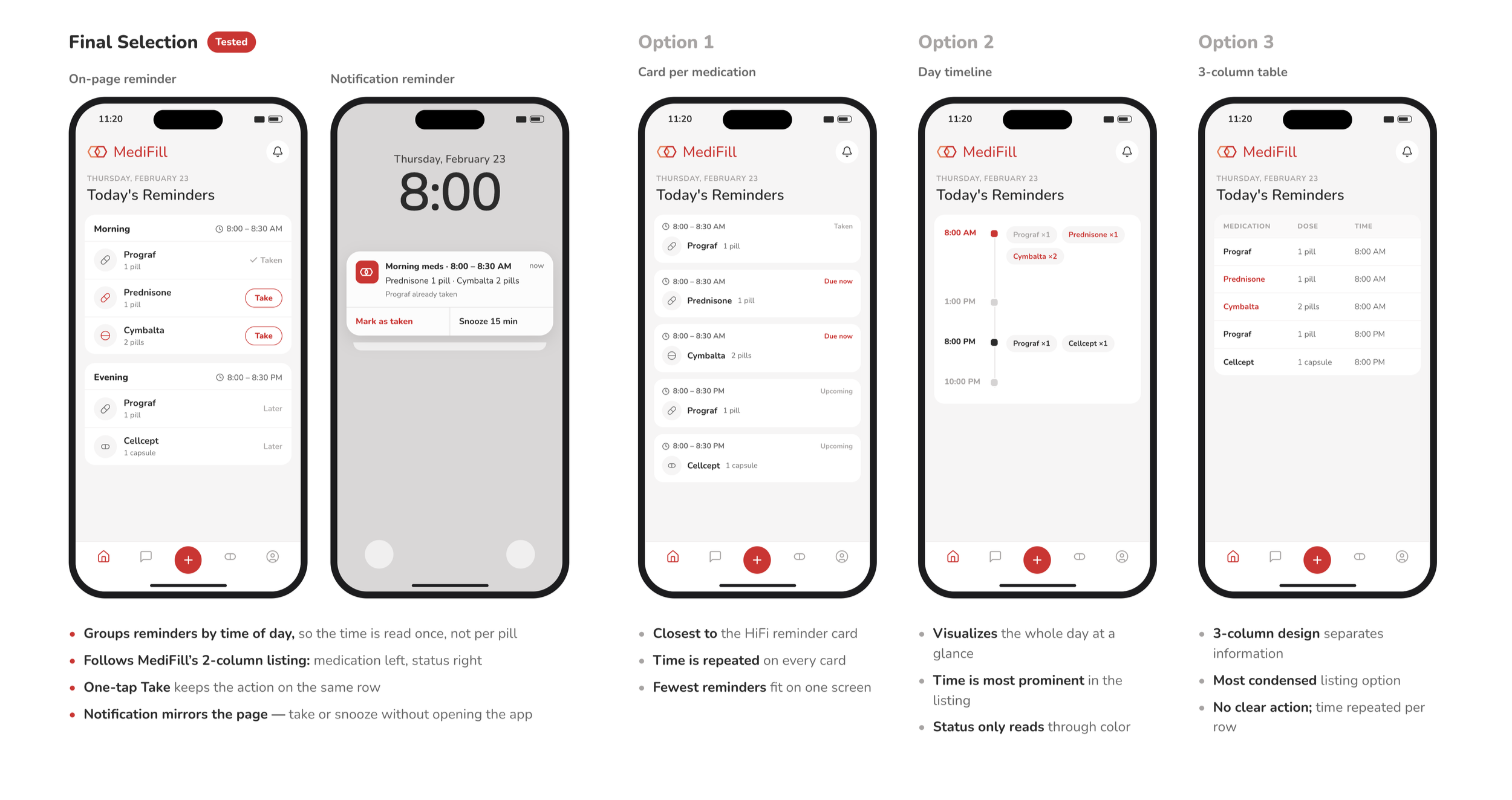
Final selection (grouped by time of day, plus a matching notification) against a card per medication, a day timeline, and a 3-column table.
Smart Filter. Rules like "with food" or "no alcohol" had to add information without overwhelming people. The tested winner puts the filters inside the pill tracker, so each rule appears as a tag on the dose it affects and inactive filters stay quiet until needed.

Final selection (filters inside the pill tracker) against native toggles, check-to-opt-in, and a progress-first layout.
Data Bank → MyMed. The Medication Data Bank, where a caregiver looks up a drug, evolved into MyMed, where they see one person's doses. Interviews showed caregivers wanted upcoming and past doses on a single page, so the question was where MyMed should appear and how disruptive it should be. A MyMed card at the top of the drug page won: the most visible prompt, with critical drug information still in reach.
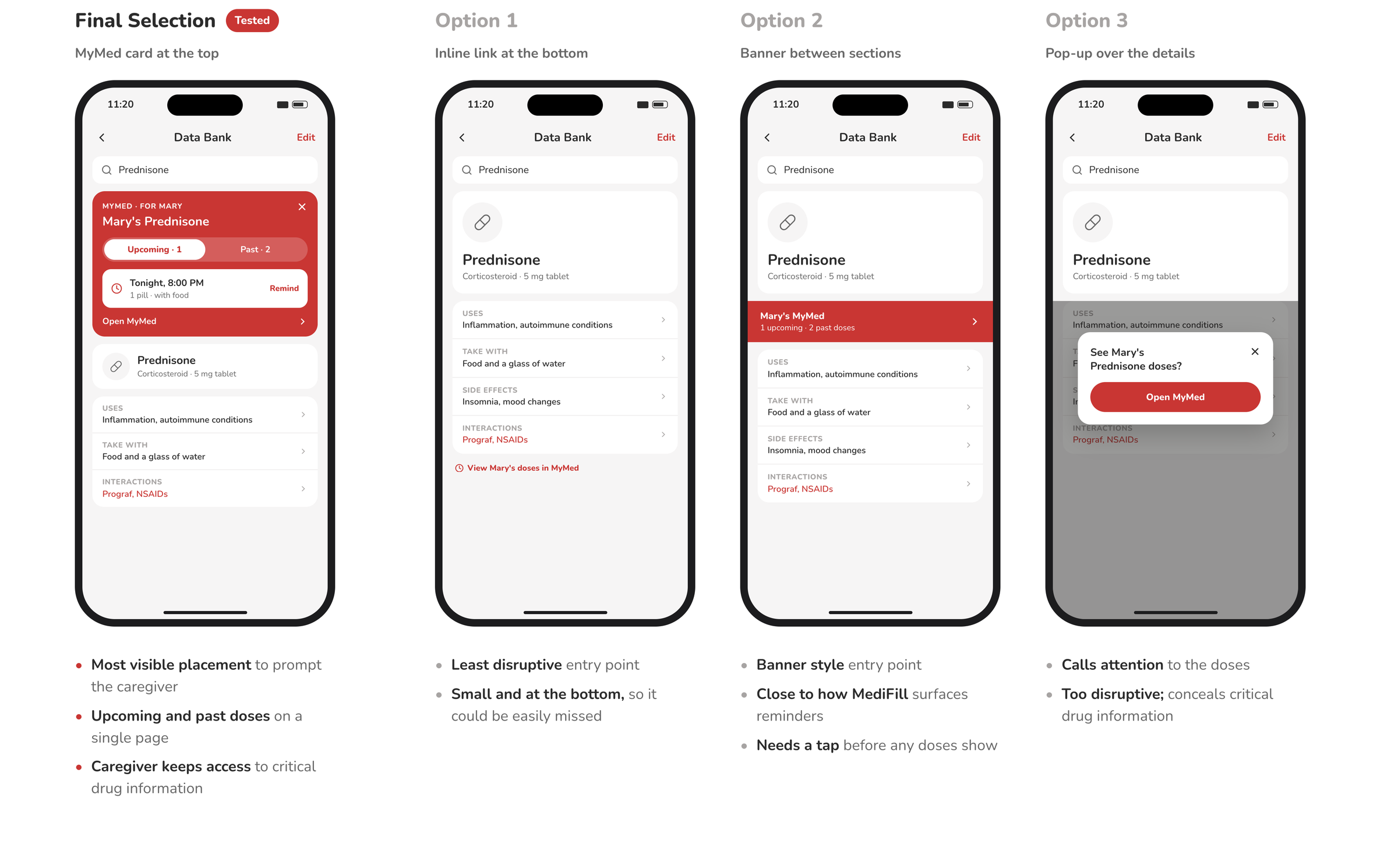
Final selection (MyMed card at the top) against an inline link, a banner, and a pop-up that hid critical drug information.
09 - The final flow
The three winning designs, stitched into the caregiver's end-to-end journey: a morning reminder taken in one tap, an evening dose snoozed, two smart filters applied, and a drug looked up to see Mary's upcoming and past doses. Text and pop-ups were enlarged after older participants found them too small.
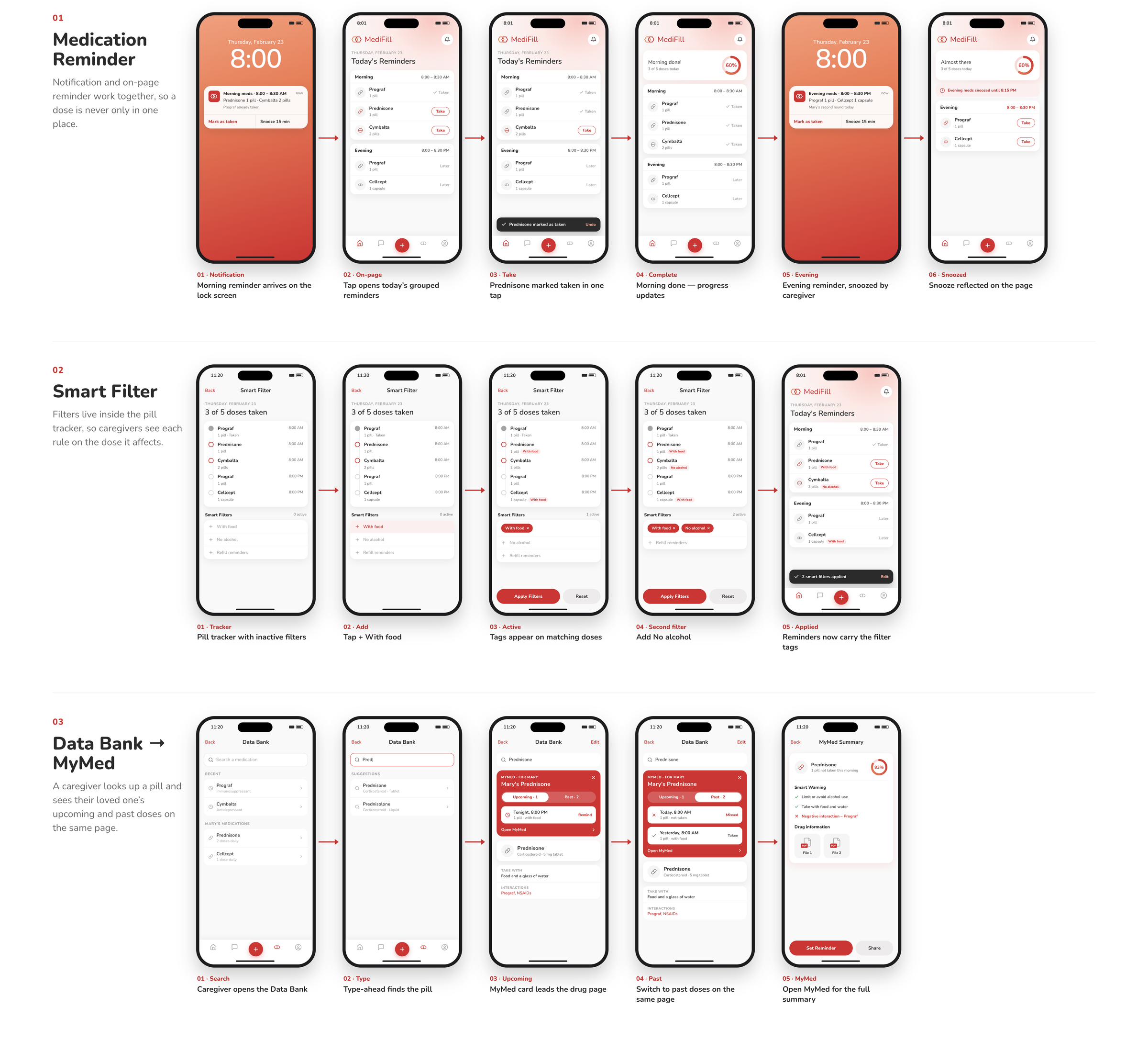
App UI built on MediFill's brand system (logo, color and type by my co-founder).
10 - MediFill as a service
The app is one touchpoint in a loop. The pharmacy fills prescriptions, the dispenser releases the right pills at the right time, the app turns each logged dose into reminders and insight, and the caregiver acts on alerts and requests refills. The more reliably doses are taken and logged, the better every part works. A second, balancing loop keeps stock steady: low pills trigger a refill alert, and the pharmacy ships.
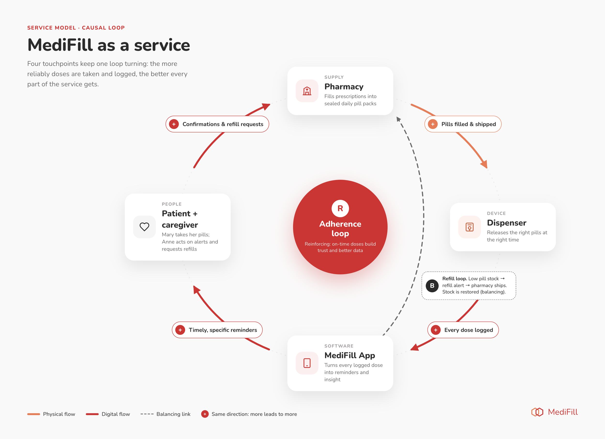
MediFill as a service: a reinforcing adherence loop across pharmacy, dispenser, app and caregiver, with a balancing refill loop.
We built the dispenser as a working mock prototype: 3D-printed, colored, branded and assembled, with a cap that dispensed a pill when twisted.

The 3D-printed MediFill container prototype, then its digital render.
11 - Outcome
MediFill paused in 2023, with the app defined, designed and tested as its phase 1 launch.
Testing drove five specific changes, from the data bank structure to text size
The rebuilt flow removed two decisions people had to make before seeing their medications
The Collective Medication Data Bank became the core of the product
We built the smart pill container as a working mock prototype: 3D-printed, colored, branded and assembled, with a bottle cap that dispensed a pill when twisted. We tested it with the 5 participants and documented their feedback, then chose to focus on the app as phase 1, so the container was not iterated further.
If MediFill launched, I would measure: medication adherence over 30 days, how often users return to the app after a missed dose, time to add a new medication, and how many caregivers stay connected after the first month.
12 - Reflection
Health tools can feel as easy as the best consumer apps. Usability and trust matter as much as accuracy when the subject is someone's health.
Words are part of the design. One line of copy changed how the same number felt.
Document the why. Health products take years to develop, so I recorded the rationale behind each decision and used diagrams to bring collaborators up to speed.
What I'd do differently: test the caregiver view as its own segment earlier, and bring in a pharmacist as a stakeholder, not just a touchpoint.
13 - How I'd do this with AI now
• Synthesis: code the interviews with AI, then check where it matched my themes and where it only matched keywords, and correct it.
• Prototyping: build a working prototype of the data bank and test it with real medication lists instead of a clickthrough.
• Revisit a ranked-low concept: users were wary of an AI conversation about their regimen. With the trust principle guiding how it admits uncertainty, it may test differently today.